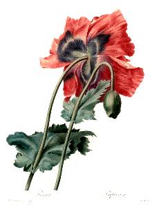
Regency Content

Regency Colors

Ever picked up a Regency novel and wondered about the strange color descriptions?
The coquelicot ribbons that raise the plain white muslin gown of the debutante above
the ordinary. The dashing heroine in a very low cut pomona green silk ball dress. The
flattering primrose morning dress on the freckled redhead who's been outside without a
hat. (Good gracious!) The jonquil gown of the young widow just out of mourning. And
don't forget the puce waistcoat on the boring suitor. Here they are in all their splendor!


Coquelicot

Coquelicot is the French name for the regular corn or field poppies (Papaver rhoeas) so poppy red it is. As today in Regency times, Paris was the fashion capital of the civilized world and French fashions the epitome of chic, so French names abounded in all matters of apparel. Coquelicot was at the height of fashion in 1794-99 a. but was used continuously throughout the period. Coquelicot was such a bold color that for well brought up [young] ladies it was only permissible for trimmings or accessories. 1.
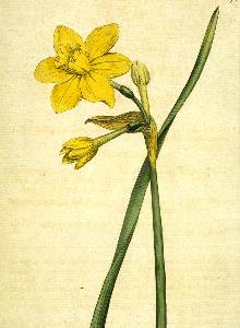
coquelicot

Jonquil

The jonquil (Narcissus jonquilla) is the small scented daffodil that grows wild in southern Europe. This plant has a more than 300 year long history of cultivation and was used in early times to hybridize our modern daffodil, thus jonquil is daffodil yellow, a true yellow color. Jonquil was The color of the 1801 b. season as jonquil was everywhere. The fashion magazines of the time mention ribbons, hats, draperies (scarfs and dress details NOT curtains!) and other trimmings in jonquil. No lady aspiring to be fashionable could do without it. 2.
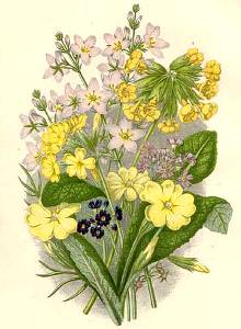
jonquil

Primrose

Primrose is one of the colors that most confuse readers of Regency romances. Is it a bright yellow as some say or more of a soft yellow as some others seem to think? That depends on what primrose we are talking about. Regency fashion comes in two primrose colors, both inspired by flowers. First we have the soft, pale yellow of the common primrose, Primula vulgaris. It has a pleasing, mild yellow color suitable for daywear. 3.
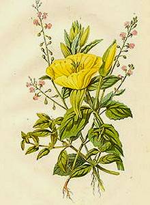
primrose

Evening Primrose

The biennial Evening Primrose (Cenothera biennis) has a much deeper and brighter yellow color. When gloves and boots are described to be of primrose color it is this darker, deeper yellow the writer had in mind. Both the primrose colors were popular during the whole Regency period, and the height of fashion 1807-1817. c. So there we have the reason for the confusion: Two colors referred to with one name! 4.
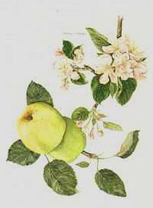
evening primrose

Pomona Green

Regency style is classic, based on old Greece and its buildings, thus classic allusions were not uncommon. Pomona was the Greek goddess of the orchards and the apple her favorite fruit. So what the Regency people called pomona green is simply apple green, a green color with a good helping of yellow in it. Green was a fashionable color both in clothes and furnishings during the Regency and pomona green apparel depicted in the periodicals of the day from 1812 d. to the end of the period. Pomona green was used both for trimming and whole dresses. 5.

pomona green

The pigment used was Oxide Green Chrome or a decoction of galls and muriate of tin, depending on purpose. It is sometimes also referred to as nascent-green or iodine green. e.


Puce

One of the more obscure colors used in Regency novels is puce. It's a color nearly always treated with disdain but what color was it, really? It might help to know that the word puce comes, as so many others, from the French. Puce is the French word for flea! Yes, the color is a brownish-purple or a purplish-pink, the color of the blood-sucking flea; coagulated blood in other words. It may seem astonishing to the modern reader that one of the most popular colors in 1805 f. was just puce! 6.

puce

A Light Puce 7. also existed, which appears to have been a somewhat muted mauve. True mauve, as we know it, came with the Victorian aniline dyes. This dye was extremely unstable, faded badly to a dingy greyish pink. The German chemist Pörnerg. is the first to refer to a color as mauve or mallow. He used considerable amounts of alun to permanent the color, with somewhat depressing results. h.

The 1830s saw the introduction of a new recipe made from indigo and logwood (Haematoxylum campechianum), the later a native to North America. This was used both for puce and mauve but in different proportions, hence 'light puce' probably being the Regency word for a 'mauve' color. Wood contains natural tannins so a wood chip based dye would've been less prone to fading.


Emerald Green

1817 i. was the year emerald green burst upon the fashion scene in a big way. The pigment - alternately called Paris green, Sheele's green, Schweinfurth green, imperial green, Vienna green or emerald green - was already popular in interior decoration, particularly on wallpapers 8. and fabric. For the first time a green dye that did not fade or darken was available and it became all the rage. Unfortunately, the basis of this lovely bluish green was a copper arsenic compound! Yes, the pigment was poisonous, but this had yet to be discovered. j.

emerald green

Cerulean Blue

Although blue shades referred to as Cerulean have existed for centuries and were not exactly inpopular in Regency times, k. the intense sky blue of today is a product of the Victorian era. During the Regency, the cerulean pigment was usually made up of a copper and cobalt mix, which had an unfortunate tendency to shift towards green. It was also a very unstable color that washed out badly. Not that the later was unusual for the times as colorfast dyes finally came into their own in the later part of the 19th century. 9

cerulean blue

Note: Before the introduction of synthetic dyes, fading was a real problem. Knowing how to make a dye bath to refresh the color of otherwise still wearable garments was part and parcel of a good housewife's repertoire. It also explains (besides the issue of washing) why rich ladies rarely used the same dress twice during the season. The brilliance of the color would've been quite diminished after washing and/or exposure to the sun.


Disclaimer: Monitors and screen settings vary. Although every care has been taken
to properly represent each color, complete accuracy is beyond the author's control.


Next: The Complexion - Regency Skin Care


Photos:

1. Pierre Joseph Redoute 'Choix des Plus Belles Fleurs' 1827-1833

2. Plate #78 Curtis Botanical Magazine 1789

3. Anne Pratt 1898-1900

4. Evening Primrose, Chromolithograph, circa 1860

5. 'Pomona Herefordiensis' Thomas A. Knight 1811

6. 19th century China

7. Fabric swatch, Ackermann's Repository, June 1810

8. Wallpaper, Nordiska Museet, Stockholm, Sweden

9. Fabric swatch, Ackermann's Repository, August 1810

References:

a "The capotes have almost all a large bunch of ribbons, or crape, in front, which are white, jonquil, lilac, and rose. The yellow and white straw hats are very common. One of the most striking head-dresses in the hat à la Uhlan, the crown of which is in the form of a lozenge, and the front a little turned up or pointed like a helmet: its colour is jonquil, rose, or all white, with feathers of the same; or striped with broad stripes, lilac and yellow, or lilac and rose, with flat feathers to match. This head-dress, piquante by its novelty, displays much ingenuity in its plan and execution." "The prevailing colour for hats and capotes of Florence, or crape, is deep violet, with jonquil ribbons or draperies, and Egyptian earth-brown, with lilac ribbons or draperies." The Lady's Magazine, or Entertaining Companion for the Fair Sex, Appropriated solely to their Use and Amusement, 1801

b "I took the liberty a few days ago of asking your black velvet bonnet to lend me its cawl, which it very readily did, and by which I have been enabled to give a considerable improvement of dignity to cap, which was before too nidgetty to please me. I shall wear it on Thursday, but I hope you will not be offended with me for following your advice as to its ornaments only in part. I still venture to retain the narrow silver round it, put twice round without any bow, and instead of the black military feather shall put in the coquelicot one as being smarter, and besides coquelicot is to be all the fashion this winter. After the ball I shall probably make it entirely black." Jane Austen's Letters, (December 18, 1799).

c "Evening Party Dress.--An Egyptian robe of peach blossom, evening primrose or lilac, shot with white or day primrose colour; apron sleeves and front of crape, en suite, trimmed with rose buds, and terminated with silver acorns; white satin hat, with regency plume; white gloves and shoes; armlet and earrings of gold." Lady's Monthly Museum or The Mirror of Fashion, 1812

"We shall be able to give our readers a more accurate description of fashion the next month. At this early part of the season, fancy, as usual, reigns with almost unlimited sway; the most prevailing colours at present are Pale Blue, Lilac, and Primrose; which will, of course, give place to the Lily." ditto 1814

d "Hat of Pomona green satin, turned up in front, and low on each side of the face." La Belle Assemblée, 1812

e. 'Encyclopædia of Chemistry, Theoretical, Practical, and Analytical, as Applied to the Arts and Manufacturers' J.B. Lippincott & Company, 1877 p 767

f "The prevailing colours are green, yellow, and puce. Spanish hats of coloured velvet, with feathers to match, are generally worn. Black velvet pelisses, trimmed all round with lace, are most prevalent." The Lady's Magazine, 1805

g Pörner, Carl Wilhelm (1732–1796), German chemist and metallurgist. "Pörner was the Saxon mining counsellor, based in Freiberg. In that position he conducted some chemical research for the Meissen manufacture, but he is better known for a treatise on dyeing, published in German in 1772 and translated into French under the aegis of Claude Louis Berthollet in the 1780s." - The Creation of Color in Eighteenth-Century Europe by Sarah Lowengard, published by Columbia University Press, 2002

h 'Anleitung zur Färbekunst, vorzüglich Tuch und andre aus Wolle gewebte Zeuge zu färben.' published by M. G. Weidmanns Erben und Reich, Leipzig 1785. Pörner's (here called Poerner) experiments are also described in 'Encyclopaedia Perthensis', 1816 edition, which is more or less has a direct translation of the original German text.

i "The favourite colours are peach down, emerald green, Palmetto green, pale tea-leaf, Spanish brown, scarlet and celestial blue." La Belle Assemblée, March 1817.

j "In the 19th century, it had been realized that wallpapers decorated with green, arsenic pigments could cause death, especially to the inhabitants of damp rooms containing these papers. Initially, these deaths were attributed to particles of arsenic being stripped from the wallpaper (Gmelin, 1839), but in 1893, an Italian physician, Bartolomeo Gosio, demonstrated that certain fungi, growing in the presence of arsenic-containing materials, produced a highly toxic, volatile material. This so-called “Gosio Gas” was produced particularly efficiently by the organism now known as Scopulariopsis brevicaulis. It was shown many years later to be trimethylarsine, (CH3)3As." Arsenic Curiosa and Humanity, Bentley & Chasteen, 2001, The Chemical Educator, Vol. 7, No. 2. See also B. Gosio, Ber. 30:1024-1026, 1897 and F. Challenger, Adv. Enzymol. 12:429-491, 1951.

k "No. 1 & 2 is a fast colored deep cerulean blue furniture chintz." - Ackermann's Repository for August, 1810.

"Parisian walking dress. Round dress of printed muslin, of a cerulean blue spotted with black, with bordered flounces of the same material to correspond : between each flounce a layer placed of black brocaded satin ribband." - La Belle assemblée, Volume 18, 1818.


..

Regency Home * Hibiscus * Art Gallery * Fascination With Water